We see letters almost everywhere we look—when we use our phones to read text messages, on traffic signs, and of course, in books and online articles. In fact, since starting this article you’ve already read quite a few letters! Letters are so common that it is easy to take them for granted and forget just how remarkable and beautiful they can be.
While we often think of letters as symbols of certain sounds, it’s important to remember that they are also images. That’s what makes the language of letterform such a fascinating and indispensable area of study for anybody in web design.
Read on to learn what typography is and what makes them so important if you are considering web design training.
Typography Are the Shape of Letters
The definition of typography is contained within the name itself: it is a term for the shape (or form) of a letter. When you understand that letters are shapes, you can then observe the individual parts that make up each letter. For example, notice how in the letters ‘b,’ ‘d,’ ‘f,’ ‘h,’ ‘k,’ ‘l,’ and ‘t,’ a line in each letter rises vertically above the typical height of other lowercase letters. That’s called the ascender. Conversely, ‘g,’ ‘j,’ ‘p,’ ‘q,’ and ‘y’ have lines that go below the baseline that the letters are written on and these descending lines are fittingly called descenders. Other easy-to-understand terms include the dot, used above the ‘i’ and ‘j,’ and the arch (sometimes called the shoulder), used to create ‘h,’ ‘m,’ and ‘n.’
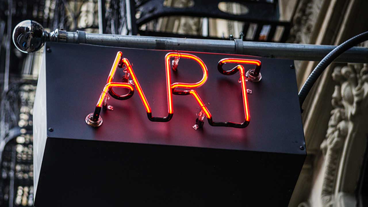
Using particular typography, such as this modern sans-serif one, can convey a specific mood or thought
How Letterforms Can Send Their Own Message
Why do all these terms matter to web designers? As you’ll learn during your web design courses, a type is an image, which means that just like images, you can use type to convey emotion, mood and particular messages. After all, a highly ornate letterform written in a cursive style might be great for wedding invitations, but would you really want it used for a stop sign? Probably not!
Once you’ve completed your web design training and fully understand the language of typography, you can use that language to help your employer’s or client’s website achieve a particular tone or message.
For example, consider the message that serifs convey. Serifs are tiny extending lines attached to the ends of strokes in some letters, such as in Times New Roman. A serif typeface is often ideal for conveying a sense of tradition, history or authority. If you were to work on a website for a history museum, church, veterans’ group or historic institution, there’s a good chance you’d use a serif typeface.
On the other hand, a letter without serifs is more likely to convey a sense of modernity, youth, and dynamism. Such letterforms are called sans-serifs. So, if a modern art museum were to hire you to design their website once you’ve completed your web designer courses, you would likely select a sans-serif typeface in order to send the message that the museum exhibits art that is contemporary, experimental and daring.
When you begin to learn more about typography—and maybe even develop a passion for it, as many graphics and web designers do—you’ll begin to understand how seemingly small changes in the design of your letters can leave a big impact on the reader.
Do you want to complete training for a rewarding career?