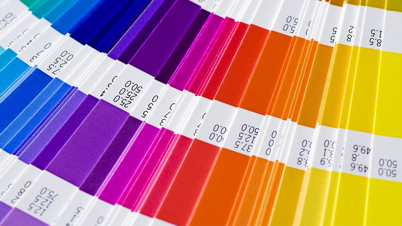
When it comes to web design, color is one of the most useful resources you can use to grab your audience’s attention. Color is often used to convey a certain emotion or feeling, which affects how your design is perceived, as well as how users interact with and respond to it on your website. With an almost endless palette of colors to choose from, it can be difficult to know where to start, which is why many web designers use a concept known as color theory.
Color theory is, simply put, the principles that guide designers when they combine certain colors. Designers match colors together with the help of the color wheel—which includes primary colors like red, yellow, and blue, as well as the other colors you create when mixing them together—but there is much more to color theory. If you’re interested in a career in web design, read on to find out more.
1. Web Designers Use Color Vibrancy to Help Convey Tone and Emotion
Colors have the power to make us feel certain emotions and reactions, and web designers can use this to influence a site’s audience or target market. This is known as the psychology of color, where every color has a different meaning and can evoke different moods.
Red, for example, is one of the most stimulating, eye-catching colors, and has connotations of power and importance. Blue, on the other hand, makes people feel more calm or safe. You have to choose your colors carefully in your web design career, because the wrong color choice may make users react to your design in a way you might not have wanted, but the right one can make them view your design in a more positive way.
2. Complementary Colors Are Important When You Become a Web Designer
Knowing the right colors to use is just as important as knowing the wrong ones, and web designer training can teach you the specifics of how colors interact with one another to get the reaction you want. Every color on a color wheel has an exact opposite directly across from it—orange and blue, pink and green, and yellow and purple all tend to naturally create a strong contrast against one another.
This relationship between colors is known as complementation. Designers use complementary colors because they are noticeably different, which can attract attention or convey specific energy. If, for example, your background is lemon yellow, you might use a royal purple to highlight specific features such as the call-to-action or sidebar.

Students can explore the way colors interact within their web designs
3. Contrast Can Draw Attention to Certain Areas of a Web Page
Contrast is one of the most important areas of color theory you will encounter when you become a web designer because it has the greatest effect on a website’s overall usability. It involves the difference in hue between two colors and can range from high contrast to low.
High contrast means that the colors you use are very different from one another, and stand out on the page, for instance, white background with black text. Low contrast involves two similarly alike colors, such as grey and black or royal blue and teal. High contrast can be attention-grabbing, but difficult to look at for long periods of time, while low contrast appears more harmonious, but can strain the eye, especially for those who are affected by colorblindness.
4. Color Schemes Have an Effect on the Aesthetic of Your Web Design
In order to make sure their colors fit well together, designers often use something known as a color scheme. These schemes are a pattern of colors you can use to convey a certain aesthetic, and there are four different kinds to choose from: monochrome, complementary, analogous, and triadic.
Complementary schemes use opposite colors to attract attention to certain areas of your design, while a monochrome scheme uses different tints and saturation of a single color, which adds cohesion and balance to your design. Analogous schemes feature three colors that are closely related to the color wheel and have similar base tones, such as orange, red, and yellow, which create a sense of harmony. If you place a triangle on the color wheel and pick the colors at each point, you would create a triadic scheme, which lends an overall tone of vibrant, yet balanced, color.
Do you want to complete training for a rewarding career?


