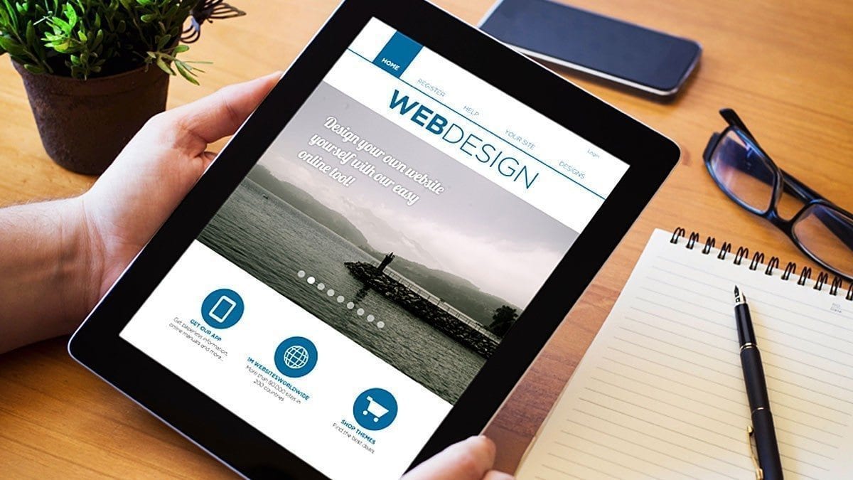
Web design is a fast-paced and exciting pursuit for creative and motivated people like you.
“Now, more than ever before, the web is a playground for designers to push the boundaries of what is possible, ” explains front-end web designer Sam Hampton-Smith. “We can experiment and leverage possibilities in creative, exciting ways.”
If you want to use your talents to earn a lasting, secure career, consider training in web design. At Academy of Learning Career College, you can work at your own pace to gain all the skills you need for making websites from concept to launch.
Start off on the right foot by learning about the biggest web design trends of 2016.
1. Web Design Career Pros Are Using Bolder, Brighter Colours & Typefaces
There’s been an increase of creative typographical choices appearing throughout the web, and not just in occasional headers. Big, bold, and bright colours in combination with custom fonts have become key marketing tools, useful in shaping a website’s brand.
“Web fonts have become accessible to all, and as a result, we’ve seen a dramatic shift in the way type is rendered online,” says Hampton-Smith. “2016 will be marked by a lot of colours and a whole lot of type!”
When you begin your web designer training, you’ll be introduced to an entire course on colour theory, where you’ll learn how graphic colour systems are designed, applied, and perceived, and how these systems interact. You’ll also master the fundamentals of typography through interactive lectures and hands-on exercises. Understanding how to manipulate colour and fonts to convey particular feelings and tones will help you meet the industry’s current eye-catching standards.
2. Modular Design Strategies Are Becoming Web Design Trends
As you’ll learn, web pages consist of various components—like search bars, headers, discussion boards, and more—organized into a cohesive page layout. Some industry leaders are now designing these components as independently-functioning modules instead of just static elements on a webpage.
“We’ve matured into knowing that we have repeated elements on different screens and that these elements need to be designed both so that they work independently and with the rest of the site,” explains USA-based graphic and web designer Amber Leigh Turner.
By designing these components with the capacity to be lifted, duplicated, and rearranged, you’ll be able to optimize their functionality for a range of platforms and devices.

Today’s web designers design web pages that adapt to devices of different shapes and sizes
3. Cinemagraphs Are Replacing GIFs as the Internet’s Images of Choice
Moving beyond animated gifs, today’s top designers are showcasing ‘cinematic’—high-resolution photos with subtle moving elements that catch readers’ attention.
“We can bring photos to life,” says Turner. “Advertisers and content producers have started to recognize the arresting power such images can have.”
While cinematography has been around for several years, the arrival of ‘live photo’ options on the latest iPhone models has made these living pictures more accessible and trendy than ever. Look forward to enhancing your own websites with emerging cinematographic tools and plug-ins throughout your web design career.
4. Flat Design Is Continuing its Hold on the Web Design Trends
Flat design was a dominant web aesthetic throughout 2015.
The simplest example of flat design is the new Google logo as it now appears flat, minimalist, sans-serif, and shadow-free. Google says this new ‘flattened’ design made it easier to read on smaller devices and helped cut the size of the logo file by more than half.
With the right training, you can try your hand at these trends and earn the successful web design career you deserve.
Visit Academy of Learning Career College to learn more about getting started.


