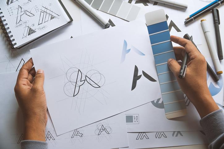
Typography is one of the most important elements through a graphic design career. Graphic design professionals who master its art are able to create designs which truly reflect a brand and convey a memorable message. Defined as arranging type in a strategic way in order to achieve a certain aesthetic goal or visual appearance, typography is a critical skill for graphic design professionals.
If you’re considering a career in graphic design, understanding typography, and being familiar with its many benefits, will help you to choose the right fonts, line spacing, point size and more, creating contrast, hierarchy and drawing attention to your designs. The moment when you discover the benefits of using the right typography, you’ll be inspired to integrate its elements into your creations. With a diploma in graphic design from the Academy of Learning, you’ll be equipped with a strong foundation of graphic design skills, including typography.
Below, discover more about the benefits of utilizing typography in your work as a graphic design professional.
Train online or on-campus for a job that pays more and means more.
Considering a career change?
1. Typography Provides Clarity in Graphic Design Careers
One of the biggest advantages to mastering the use of typography will be the clarity of the message that you send through your design. When graphic designs are composed of mostly images, their intention can be difficult to discern, and viewers can get lost in the different nuances of the design. However, with the right typography, professionals in a graphic design career can attract attention to important words and phrases, conveying the intended message in a way that the viewer can quickly and easily digest.

During your graphic design career, use typography to send a message to viewers with your designs
2. Establishes a Hierarchy
When used strategically, typography is effective in creating a hierarchy that the viewer can easily follow. In designs like brochures, newspapers or certain web pages which might be text-heavy, using the right typography helps the headlines and important text to stand out, immediately catching the reader’s eye. Juxtaposing different fonts and using various sizes can establish a clearly visible hierarchy, guiding the viewer through the text and enabling them to discern the information they should be paying attention to.
3. Creates Brand Recognition
Some brands can be recognized simply by the font they use–think Coca-Cola, Visa, Disney, and Adidas, for instance. After earning your graphic design diploma, your knowledge of typography can help you to create more recognition for the brands you work with through the use of different typefaces and fonts. The right logotype will give brands a higher level of personality and appeal while encouraging consumers to familiarize themselves with the brand.
4. Conveys a Brand’s Values
Typography can go beyond creating recognition, it can also reinforce a brand’s core values. As a creative professional, you probably understand the power that art can have in conveying mood and feelings, and the same concept can be applied to the use of typography in graphic design. The right typography can invoke certain emotions or sentiments around a brand. For example, a more professional brand might use a simple, elegant black and white typography, while a colourful cursive could be used for a more whimsical, creative brand.
5. Reinforces Design Consistency
When it comes to bringing a design together, there’s no better way to ensure cohesion and consistency than with typography. Rotating between the same fonts for the heading and body contributes to a more harmonious design, establishing continuity and enhancing brand recognition. After completing a graphic designer course at AOLCC, make sure to experiment with typography in order to take your designs to a whole new level.


